Introduction
This book aims to provide a gentle introduction to building websites from scratch for the complete beginner; someone who is comfortable browsing the web and navigating their way around websites, but who has never tried to edit a webpage and knows nothing about the technologies that make them work. The only knowledge that I assume you will have is being able to open a browser and navigate to a web page and knowing how to create, edit and save documents with a computer text editor. Everything else will be explained as we go along.
What we'll cover
Over the course of this book I hope to introduce you to HTML, CSS and JS, the 'languages' of the web and show you how to use them to build simple web sites. If the mere mention of acronyms like these makes your eyes start to glaze over, don't worry, all will be explained and by the time you get to the end these should be as familiar as terms you use in your everyday life.
The best way to learn how to do something is to actually do it, and websites are no exception. We'll create two simple websites over the course of the book: a single-page portfolio website that we'll slowly develop as we go along, adding pieces as we learn the concepts behind them; and a final project which will be a rather more complex blog website that will bring together much of what we've learned earlier as well as introducing some new techniques.
Why read this book?
There is a wealth of high quality material available on the web and in book form for those who are interested in learning to build websites, much of it written by people far more knowledgeable and experienced than myself; with that confession out of the way it may seem strange to write another guide when there are already so many available, but my reasons for doing this have a lot to do with the history of the web itself1.
The web has not always been like it is now. When it first came into being at CERN during the 1990s web pages consisted of little more than text and a few images. Humans being humans, however, people soon started trying to build things on the web that it had not originally been designed with in mind. As developer's imaginations rapidly oustripped the limited tools available in the original specifications, they had to resort to various hacks and workarounds to try and implement them. Over the years, as certain trends became more common place, web browsers (and those who write the specifications that govern the web) started to offer more sophisticated tools to create them.
The result of this process of evolution is that there are often multiple ways of achieving the same goal when it comes to building websites. Many existing books and tutorials teach these in the same way that the person writing them would have learnt them; starting with the early workarounds and only teaching the newer, purpose-built techniques when you have mastered the old way of doing things.
For me personally, when I came to learn web development and later to teach it to others, this always felt a little backwards as the newer techniques are often quicker to pick up (even if they may seem a little counter-intuitive to someone who is used to the more established ways of doing things) and can result in websites which are quicker to load and easier to modify in the future.
With that in mind, that is how the book will progress, teaching you contemporary ways of doing things2 wherever possible, and only mentioning older workarounds where it seems necessary. With that introduction out of the way, let's get started.
What you'll need
One of the best bits of building websites is that the tools required are very simple indeed. All of the languages of the web mentioned earlier are text based, just like written human languages. So to create websites all you need is a text editor3 and a web browser to view it in.
Whatever is the default text editor your operating system comes with will be sufficient (e.g. notepad on Windows, often gedit on Linux etc.). However, there are dedicated text editors designed for programming and web development which come with a variety of features to make your life easier as they can highlight mistakes and cut down on repetitive typing. I personally use a free editor called VSCode, but Atom and Brackets are also very good choices.
While technically it may well be possible to follow along with these tutorials on a phone or tablet, the experience is likely to be anything but pleasant. Web development involves a lot of typing and switching between windows, which is not something mobile devices are really designed for. In light of this, I do highly recommend you follow these tutorials on a desktop or laptop as it will make your life much easier. However, I make no assumptions on what type of device this will be, or the operating system that you run on it, use whatever you are most comfortable with.
A note on feedback
I'm writing this book in the open, and all the source files used to create it can be found on github. If you spot a spelling mistake, typo, or gross technical inaccuracy and would like to correct it please feel free to open a pull request with a correction and admonishment appropriate to the level of my transgression.
Similarly, if you have followed along with the tutorials and have any feedback on what you found helpfull, or areas that could be improved please send me an email to [email protected] with any comments or criticisms you have. Hopefully, together we can make this book better for everyone who reads it.
Finally, if you have found these tutorials useful in any way and have some pennies to spare you can also sponsor me using github sponsors or patreon which will allow me to dedicate more time to working on the book. Also, if you have a Coil subscription, I should get a small amount of money when you read this book.
Footnotes
- There is also a second, dark ulterior motive to the writing of this which is to refine my own skills. It is often said that the best way of improving your understanding of a subject is to try and teach it to others; little do my readers realize that they are merely pawns in my ascendency to figurative web development godhood.... ahem.
- In web development, as in most other things in life, there is definitely more than one way to skin a cat and there is generally no one 'best' way of achieving something. What I will cover is (hopefully) a good way of doing things using contemporary technologies.
- This must be an actual text editor such as notepad as opposed to a word processor such as Microsoft Word as word processors add additional formatting to documents which will prevent webpages from working correctly.
HTML
Before we start learning to build websites, it would be beneficial to briefly explore what they actually are and look at a simplified version of what goes on 'under the hood' when you visit one. For the purposes of this example, we will use a page that should be familiar to most: the Google Homepage (https://www.google.com/).
The Internet and the Web
You are probably used to thinking of websites and webpages as existing somewhere 'in the cloud' or on the internet. The very name web browser suggests something that allows us to look through the world wide web as a thing that exists somewhere else. Like most people, you may have heard of the terms 'internet' and 'world wide web', and may even use the two interchangeably. In reality, however, websites are very much rooted to physical objects and the web and the internet are two separate, but related systems that allow us to access them.
The Internet has been around for over half a century, and is a collection of computers all over the world that are connected (or networked) together to allow exchanging information between them. Each computer connected to the internet is assigned a unique address (an IP, or Internet Protocol address), which is a string of numbers that allows sending information to that computer specifically. Think of it a little like the houses in a country, each one has a unique postal address and, using that address, we can send something to whoever lives there.
There are several systems that use the internet as an infrastructure to exchange information. For most people, the two that they will interact with most frequently are email, and the World Wide Web; there are others, but many have become little used by the majority of internet users.
Email is conceptually the simpler of the two, and can be thought of a little like communicating with your friends or relations via letter. You write a letter and then put it into an envelope (a packet) addressed to the house where your friend lives, then the postal service (the internet) delivers it. Once the packet arrives, your friend can open it and read what you have written.
The important think to note here, is that the delivery mechanism (the post office or internet) doesn't need to understand the contents of the packet, only where it is addressed to. This means that any systems that build upon the existing infrastructure are free to use whatever form of information they like; you can write letters to your friend in any language, using some kind of secret code, or even communicate purely through pictures or objects - the postal service only cares about delivering your package successfully.
This is, of course, a heavily simplified version of what happens, but should be sufficient for our current purposes.
The World Wide Web
Like email, the World Wide Web is another system that is built on top of the internet. It was created at CERN (The European Organization for Nuclear Research) in the early 1990s as a way of sharing scientific data. Since then, the web has evolved enormously, but its fundamental structure is still the same; a collection of documents (now more frequently called pages) organised into sites. Each document conveys a piece of information, whether that is scientific data, instructions on how to cook a dish or fix a piece of machinery, a list of products you might be interested in buying, the latest news stories, or any other of the myriad uses that the modern web is put to.
Some webpages are drifting further and further from the original model of being a document conveying information (online games for example), but the fundamental structure of the web is still tied to that purpose.
Making Requests
You can think of the web like a distributed library; where documents (web pages) are spread out over several different locations (web sites). If you wanted to read a document, you would first send a letter to the site which held the document you are interested in, and they would send you back a copy of the original.
For us to view a webpage, our web browser must request a copy of it from the computer (referred to as a server) on which it is being stored. We could use the server's IP addresses to do this, but that has several downsides; a string of random number and to do that, it must have a way of uniquely identifying the particular page it needs, along with the computer that is storing it. These unique addresses are called URLs.
URL
URL stands for Uniform Resource Locator, and each is divided into 3 main parts: the protocol, which is the first part of the url up until the :// (in this case https); the domain name, which is the central portion of the url (in this case www.google.com); and finally the path, which is the last part of the url from the forward slash onwards / (here only a single forward slash as we are accessing the website homepage). Your browser may hide the protocol (and path if it is the homepage) when a page is displayed in its address bar, but they are still there and will be visible if you copy and paste the url somewhere else.

Protocols
The protocol is the method in which the browser accesses the resource, think of it a little like the various ways you could send a message to someone, such as writing a letter, calling them on the phone, or sending them a text message etc. For the purposes of building websites we don't need to understand how these work in-depth, just that http is the primary protocol used by the web, and that https is its more secure cousin.
Domain names
The domain name is the unique identifier of the particular website we are visiting. It is also the part of the URL that allows the browser to locate the computer on which the resource it is trying to access is being stored.
If we were to think of resources as items stored in a warehouse, the domain name would be the address of the warehouse itself. Domain names are actually split up into smaller chunks, but we don't need to cover that for now.
Paths
The path is the location of each individual resource within the domain. To reuse the analogy from earlier, if the domain name is the address to a warehouse, the path is the code for the slot on a shelf where the resource is stored.
As each URL must be unique, a domain could not have two resources with the same path; however, the same path on different domains would point to completely different resources (e.g. https://www.smashingmagazine.com/contact/ and https://www.mozilla.org/contact/ are totally different pages on separate websites).
Requests and Responses
When you come to type a web address into your browser's address bar it must first make what is called a DNS lookup. This essentially involves consulting an online address book to find the IP address (a bit like a direct phone number) of the computer that stores resources for the domain name. In web parlance a computer that stores resources in this way is known as a server, and storing said resources is called hosting.
There are far too many websites out there for browsers to maintain their own address books of servers. Not only would they have to keep up to date with new ones being added, but also manage any changes of IP address where a website moves to a different server. Instead, they first consult the DNS directory to find the current IP address of the website you are requesting.
Using this address the browser then makes a request to the server hosting the website for the page that you want to view.
All being well, the server should respond to this request by sending the page back as a .html file. This .html file contains a description of the content of the page you wish to view and your browser uses this to render the page on your computer (displaying it on the screen for many users, but also reading it out for those who are blind or have a visual impairment).

To build websites, therefore, we need to create them in the format that browsers can understand: HTML.
Hyper-Text Markup Language
HTML stands for Hyper-Text Markup Language. Hyper-Text is essentially techno-geek speak for documents that link to other documents.
To return to the example of www.google.com, when you make a search on google it scans the web for pages that might match the words you are looking for, and presents them as a list of links sorted by what it feels are the most relevant. Selecting any of these links will take you to that page so you can continue your search. It would probably not be exaggerating things much to say that links between documents are the single thing that contributes the most to the usefulness of the web.
To continue on with our breakdown of HTML you will notice that the L stands for language. In this case we are not referring to a language like English, Chinese, or Arabic, that is used by people to communicate with one another, but instead what is know as a computer language; which allows people to communicate with computers.
Fundamentally, computers deal in binary, familiar to most as long strings of 0s and 1s like this: 011000012. Having to use binary every time we want to tell a computer to do something would obviously become quickly tedious and error prone, so very clever people have invented a whole series of languages which are closer to those you would use in everyday life and which we can use to write instructions that the computer will then convert to binary before it follows them. There are a whole host of different computer languages for different use cases, and HTML is the one we use for describing webpages.
That, then, just leaves us with Markup. Markup describes the fact that HTML is a language for marking up documents; annotating parts of them to give them additional meaning. These annotations are what allow the browser to determine whether a particular part of the page is a piece of text or an image (along with a whole host of other possibilities) and serve as the instructions for how to build the page.
In the next chapter we will start to look at how html documents are formed.
Footnotes
- Anything that can be accessed on the web is classed as a resource, so not just pages, but also images; videos' pdfs etc.
- The number 01100001 is a binary representation of the lowercase letter a in the ASCII character set (a sort of code for representing letters with just binary numbers). As you can see, just typing out the word "Hello" would be very time consuming if we had to work in pure binary.
Tags and Elements
Web pages are just specially formatted text files. As alluded to in the previous chapter, the web browser needs to know what form the various pieces of content take in order to reconstruct the page for display or reading out. This is achieved through the use of tags. Here's a simple example:
<h3>I like cats</h3>
<p>I like cats</p>
Above you can see two identical lines of text, surrounded on either side by a series of strange looking characters. When the browser comes to actually display the page they will look like this.
I like cats
I like cats
The characters on either side of the line of text are the tags. The opening < and closing > angle brackets denote that this is a tag as opposed to actual content and the letters and/or numbers in between determine the type of tag it is (its identifier). In the example above the first line is a level 3 heading (html has 6 levels of heading of differing importance, h1 being the most important and h6 the least) and the second is a paragraph.
When the browser comes to process the html file it will see the opening tag (e.g. <h3>) and know that everything following it until the closing tag (e.g. </h3>) is the same type of content. The backslash / directly following the opening bracket of the second tag denotes that it is a closing, rather than opening, tag.
The whole section of text including the opening and closing tags, as well as the content in between them, is referred to as an element. In this case the first line is a h3 element and the second a p element. A web page is just a collection of different elements.
Element relationships
Elements don't have to proceed purely one after another, however, and can be nested inside one another to represent complex relationships. These relationships are very much like those you have with other members of your family, and thus share similar names with them. Any elements added in between the opening and closing tags of an element become 'descendants' of that element and will become associated with it. Time for another example:
<p>Todo list</p>
<ol>
    <li>Wake up</li>
    <li>Have breakfast</li>
    <li>Learn more about HTML</li>
</ol>
What we have here is a series of li elements, nested inside an ol element. An ol is an ordered list, and li stands for list item. Here the ol is the parent of the li elements, which are in turn siblings of one another.
When rendered by the browser, the above html will look like this:
Todo list
- Wake up
- Have breakfast
- Learn more about HTML
The advantage of being able to form relationships between elements like this is it brings additional context to information. Here we can see that not only are the li elements items in a list, but they are all members of the same list and should be processed in a particular order. Consider another example:
<p>Todo list</p>
<ol>
   <li>Wake up</li>
   <li>Have breakfast</li>
   <li>Learn more about HTML</li>
</ol>
<p>My favourite foods</p>
<ul>
   <li>Pizza</li>
   <li>Pasta</li>
   <li>Cake</li>
</ul>
Here we have added another list after the first, in this case, however, it is an unordered list, or ul. While we now have 6 li elements, they are not all member's of the same list, and thus should be treated separately. Also, while the second list still represents related items, they do not have any particular ordering associated with them. Here's how the modified example appears when rendered by a browser:
Todo list
- Wake up
- Have breakfast
- Learn more about HTML
My favourite foods
- Pizza
- Pasta
- Cake
There is no limit to the number of levels that elements can be nested, and most webpages will have a large number of different elements with complex relationships resembling the most well-researched family trees.
We've covered quite a lot in this chapter, so don't worry if it doesn't all take first time. Even experienced web developers often need to go over new material several times before they fully understand it. As long as you comprehend the principles behind what you've just read you should be fine and shouldn't need to remember the specifics; it will become second nature soon enough.
In the next chapter we'll look at our first web page.
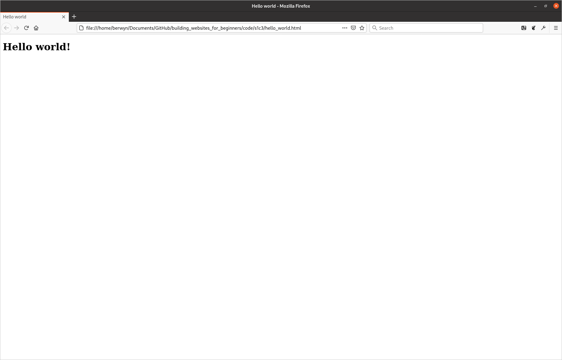
Hello world
Now that you know what html tags and elements are we can look at our first webpage. There is an old tradition when learning any new computer language to first write something to display the sentence "Hello world!" to confirm everything is working correctly, and we are going to follow this.
To start with, please create a new file somewhere where you will keep your new webpages and call it hello_world.html, then open the file in a text editor and paste the following lines into it:
<!doctype html>

<html lang="en">

    <head>
        <meta charset="utf-8" />
        <title>Hello world</title>
    </head>

    <body>
        <h1>Hello world!</h1>
    </body>

</html>
If you then save the file and open it with a web browser you should see something like this:
There is a little bit more html here than I have shown you previously, but we will go over it line by line to explain what each element does.
The first element in the document is <!doctype html>, this is simply a marker to tell the web browser that the document is a html document. It also indicates that this document is formatted according to the HTML5 specification1, which is the current standard.
Attributes
The next element is a bit more interesting as it introduces something we've not encountered before, have a look at just the html element, I've put an ellipsis character … in between the opening and closing tags to indicate that there is other content there that we are not currently interested in.
<html lang="en">
    …
</html>
You will notice that there is some other text in the opening tag, after the tag type, but before the closing angle bracket. This is what is called an attribute. Attributes give additional meaning to elements than their type alone confers. In the case of the html element, it has a language attribute indicating that the content of the webpage is written in the English language. Other possibilities include fr for French and ar for Arabic2.
Attributes consist of the name of the attribute (what type it is), an = sign and the value of the attribute (almost always enclosed in quotation marks ""). Elements can have any number of attributes and they are separated from one another (and the tag name) by a space.
The other thing to note is that, as the html element wraps everything else in the document, it is the ancestor for every element on the page. It is often referred to as the 'root' element as, like the roots of a tree, all the branches are descended from it.
The html element always has two children, head and body. As you may be able to deduce from comparing the code for the webpage with what is displayed when viewing it in a browser, the body element contains all the actual content for the page; any elements that you add as descendants of the body will be rendered by the browser when someone views the page. The two elements which are inside the head tags don't seem to be being displayed, so what is their purpose? The answer to that is that they are proving 'metadata' about the page.
Metadata
To quote wikipedia: "Metadata is data that provides information about other data". That may sound opaque and possibly a little intimidating, but the concept is actually quite simple. If we were to for a moment pretend that our website was actually a piece of music on our computer, the body of the page would be the song itself and the head would be all the information about the song; such as its Title, the Artist, Composer, Album it is from, and Year in which is was recorded. None of this 'metadata' forms part of the song itself, but it provides us with a lot of additional information about it. Similarly, if you were to view a photograph on your computer, it might also have some metadata attached to it proving information about when the photograph was taken, what camera and lens were used to take it, and what the exposure settings were.
The elements in a html document's head are no different, and provide information to the browser and user about the page. In the case of our example above, there are only two elements in the head, but there can be many more. The first element is a meta element, with the charset attribute. All text on a computer is stored using a particular "character set" which tells the computer how to convert the binary 1s and 0s into letters, a little like morse code allows transferring messages using only dots and dashes. The charset attribute tells the browser that the text on the page is encoded using the utf-8 character set, which is generally the one used on the web.
Empty elements
You may notice that there is something unusual about the meta element that we have not encountered before; it is missing a corresponding end tag. The vast majority of html tags are used to provide meaning to pieces of content, such as the h3 and p elements we have seen previously. meta elements, however, do not wrap any content, and exist purely as containers for attributes. To save you having to type out both opening and closing tags for elements like these, and to avoid them being given any child elements which would be considered invalid, HTML requires you to skip the closing tag entirely.
There are a few of these empty elements and we will encounter some of the others later. While HTML5 allows you to type out the element as if it was just an opening tag (e.g. <meta charset="utf-8">), previous versions of the specification required you to explicitly mark them out as self-closing by adding a forward slash / before the closing angle bracket, and it is a good idea to do this so you can tell at a glance which elements are empty. Throughout this book I will use the convention of adding a forward slash to all self-closing tags.
The only other element in the head is a title element with the content "Hello world". As the name suggests, the title element tells the browser what the page's title is, and is used on browser tabs and and when the page appears in search results. Try changing this and refreshing the page, the title of the open tab should change to whatever new text you have entered.
Body content
The other child of the html element is the body element and, as alluded to above, includes the actual content of the page. For now we just have a h1 element with the content "Hello World!". Try changing this text, or adding in some of the elements we covered in the last section and refreshing the page in the browser to see how adding elements to the body changes what the browser displays; make sure you remember to save the text document though, otherwise the changes you make will not be rendered.
Footnotes
- HTML has gone through several major revisions in its history, each one adding (and occasionally removing) features.
- The lang attribute can also be added to other elements on the page where you have text in multiple languages. Where this is the case, try and set the html lang attribute to the one used for the majority of the page and use lang on other elements where they differ from the main content. For a list of all the languages that the attribute have a look at the HTML Language Code Reference on w3schools..
Starting the first website
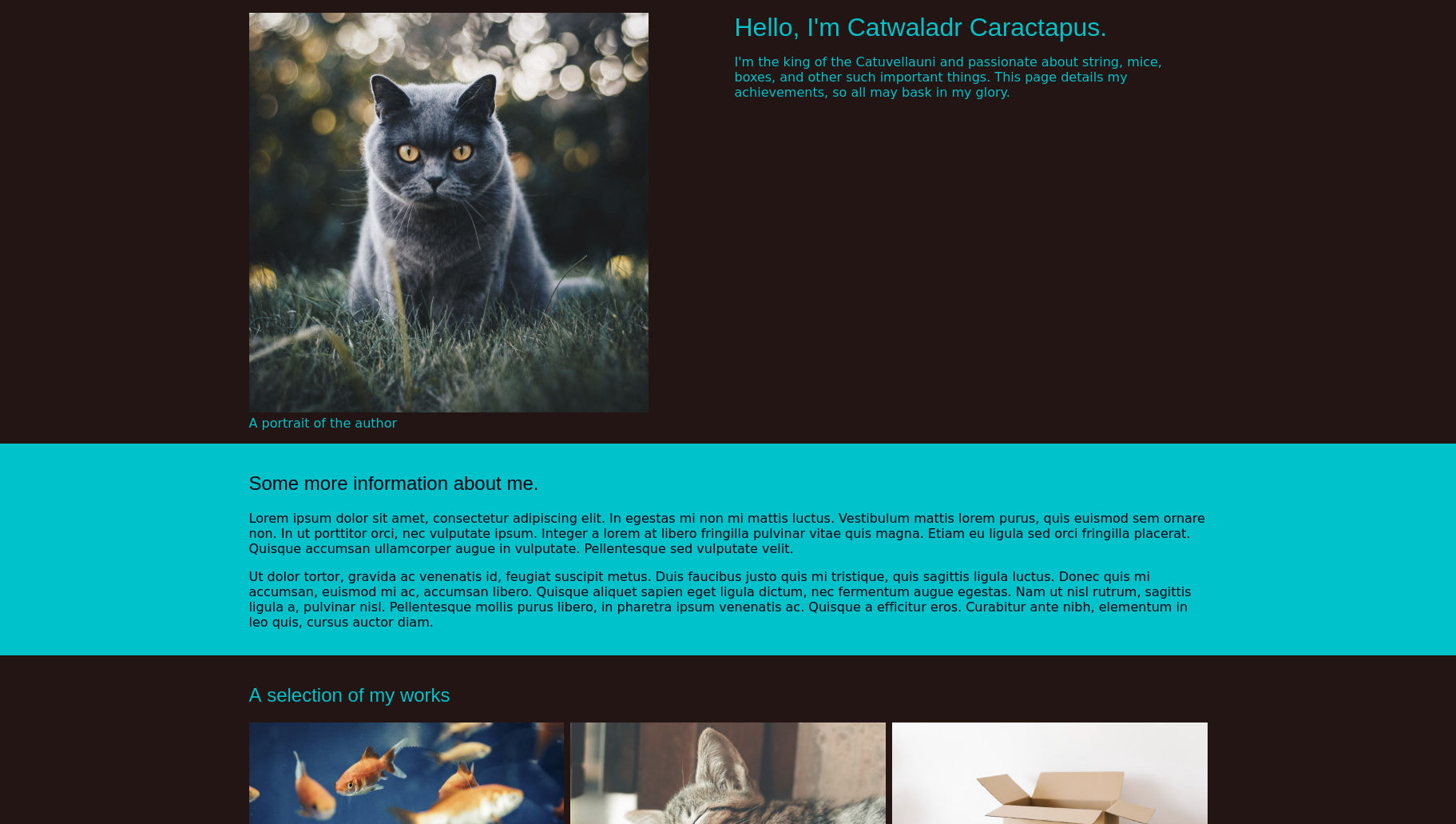
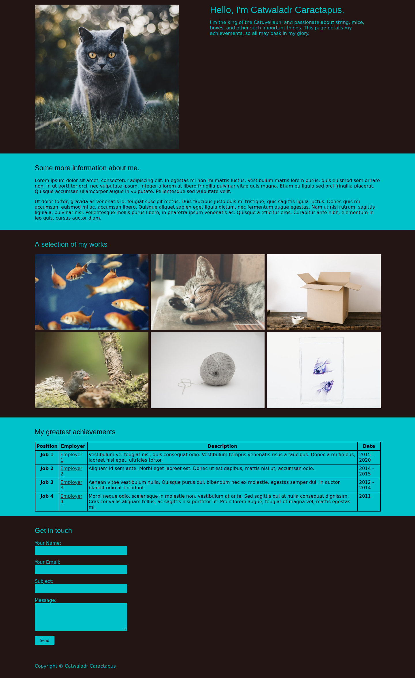
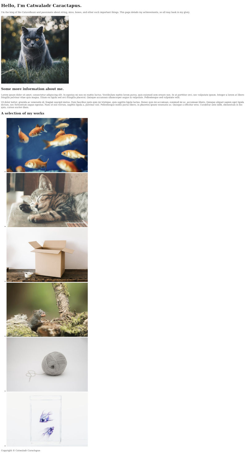
Now that we have seen how html documents are structured we can start building our first webpage. For the rest of this section we will expand upon our knowledge of HTML by building a simple portfolio page, adding sections to it as we learn about some of the different types of elements that are available to use. Then, in the next section on CSS, we will add some styling to make the page more visually interesting. By the end of the CSS section we should have a completed webpage that looks a bit like this:
Content. Styling. Interactivity.
You may remember that in the introduction I talked about the web being made up of three main languages (HTML, CSS & JS) and that, while we have only just started learning about HTML, I have already started talking about CSS. Panic ye not, there is a reason for this.
Back in the early days of the web all pages were built entirely in HTML, which has very little scope for modifying the appearance of individual elements. If someone wanted to change the way a particular part of the page looked, therefore, they would often have to change which elements they were using. A common example of this is trying to make headings look smaller by replacing all h1 tags with h2 tags, or even, h31. This comes with some major downsides.
Humans are very good at inferring contextual information from the visual relationships between objects. Machines (and those humans who can not see), however, are not and the content of a page where any text that you wanted to make bigger had been wrapped in heading tags would read very differently to them. As a result, any page built with elements selected for visual appearance rather than meaning can be very difficult for screen reader users to understand, and would likely appear incorrectly when being indexed by a search engine, or in any other system where a machine first processes the page.
To overcome this difficulty, webpages are now built using more than one language. HTML is used purely to describe the content of the page, while CSS controls the appearance and JS any additional interactive elements that are needed. By having a separation of concerns between the different languages like this, we can ensure that our websites will work in the widest possible context; there is no point making a beautiful website if no one can find it using a search engine and when they do stumble upon it by accident they can not use it if they have any disabilities.
HTML also comes with a lot of functionality already implemented by browsers that, if you use the wrong element for the job, you either have to recreate yourself, or lose altogether. Despite the advantages of using HTML purely to describe the content of a page, many people still try and use it to handle appearance and layout as well. Please don't fall into this trap as it will make life a lot more difficult for both you and your users.
I mention all of this because firstly it is important2, and secondly because after the end of the section on HTML our first website will actually look rather more like this:
Please don't let this put you off. It might not look like much, but it will be the solid foundations from which you can build an amazing website. Before you know it you will have also got the hang of CSS and will be building useful and beautiful websites.
That's enough talking from me, let's get our hands dirty with some more HTML.
Footnotes
- Though there are many others such as turning links into buttons, or even using images for text.
- I really do apologise for going on so much about this topic. Rants like this will be kept to an absolute minimum I promise.
Basic page structure
In this chapter we're going to begin work on the initial html structure of our first website. The core purpose of any html document1 is to convey information; whether that is the particulars of a breaking news story, the recipe to cook a certain dish, or even the various prices and specifications of different products that visitors might like to purchase. If you look at a selection of different pages from across the web, however, you may notice that they frequently contain a lot more than just this core content. This very often takes the form of elements which are shared across the site, such as a header with navigation and the site logo, or a footer with copyright information, but can also be supporting information more specific to the page, such as a sidebar with a list of related posts.
As all of this ancillary information is separate from the main page content, we want to contain it in different elements in order to differentiate it. First things first, though, we need to create our new project. Typing out the required elements of a page every time you start a new project can become quite tedious and error prone, fortunately, we already created a minimal page that we can use as a starting point in Chapter 3. Copy hello_world.html into a new folder that will contain all the files for our current project2 and rename it to index.html.
Website file structure
The reason that we are renaming the file is that, when you come to actually upload your website to the web, the server that hosts it will need to locate which file it should serve to visitors when they request a particular page. The convention is generally to have each page in its own folder, with the structure of the folders mirroring that of the pages on the website3. When the server comes to look in the appropriate folder for a particular page, it will first look for a file called index.html, so we're just making its job as easy as possible.
Once you have copied and renamed the file, the next step is to open it in a text editor and remove the <h1> element from the <body>, so that it looks something like this.
<!doctype html>

<html lang="en">

<head>
    <meta charset="utf-8">

    <title>My website</title>
</head>

<body>
</body>

</html>
This is about the minimum information a browser needs to properly load and render a page and we will expand upon this by adding all of the content for the page into the empty body.
<header>
The first thing we are going to add to the page is a header element. Add the following lines4 right after the end of the opening body tag:
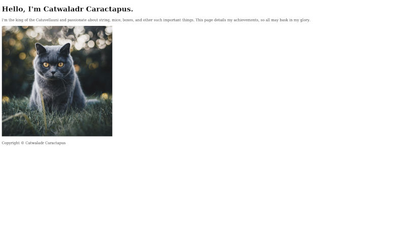
<header>
    <h1>Hello, I'm Catwaladr Caractapus.</h1>
    <p>
        I'm the king of the Catuvellauni and passionate about string, mice, boxes, and other such important
        things. This page details my achievements, so all may bask in my glory.
    </p>
    <img src="./images/pexels-kirsten-bühne-1521304.jpg" alt="Grey cat with yellow eyes sitting on grass." />
</header>
The header element serves as a container for introductory content about the page, such as the page's title, date it was created, the author, brand image etc. In this case we have added the page title as a h1 and a short introductory paragraph contained in the p element. As mentioned above, the header does not represent the main content of the page, but rather supporting information that tells us more about it. In some respects, it is a little like the head element we encountered earlier, but with the important distinction that, because it is a descendent element of the body, anything contained within it will be displayed to the user.
Replaced elements
The last child of the header is a new type of element we have not seen before, an img. Img stands for image, and is the tag used to add images to a page. It is also one of a handful of special tags referred to as 'replaced elements'.
Because HTML files are text files, and most image formats are stored as binary, we can not embed them directly into web pages. Instead, we must use an img element with a src attribute that contains the location of the image we want to embed into the page. When the browser comes to process the html file it sees the img tag and looks for an actual image in the location pointed at by the src attribute. If it finds an image it then displays it at the same location as the img element. Video and audio clips also have to be embedded into pages in a similar way (using a video and audio element respectively) for the same reason.
When browsing the web you may have occasionally seen a strange little icon like this where instead you expected to seen an image:
As the image referenced to by an img tag is stored separately, there is no guarantee that the browser will be able to load it and, rarely, you will instead get this icon; either because the referenced image has moved, or the connection to download it was interrupted.
Paths
The src attribute on our img is pointing to ./images/pexels-kirsten-bühne-1521304.jpg. If you are using Mac or Linux this probably looks very familiar to you, but Windows users might be wondering why the slashes are facing forwards (/) instead of backwards (\), so we will take a few moments to explore how paths work on the web.
The web uses Unix5 style paths. In this system, directory levels are seperated by a forwards slash /. The ./ at the start of the path denotes it is a relative path, one that starts from wherever the current file is. Paths can also be absolute (starting with a forward slash /), which means that they start from the root, in the case of a website this is usually the location of the homepage's index.html.
Using this slightly simplified model of how paths work we can deduce that the server will be looking for a file called pexels-kirsten-bühne-1521304.jpg in the images folder that resides in the same location as the index.html file that is referencing it. If this is a little over your head at this point, don't worry, you'll soon get the hang of it. All you need to remember is that the webpages you will be creating are all .html files that need to reference other files on the server, so the paths you enter into any src attributes need to reflect this.
Alt tags
The other attribute on our img element is an alt attribute, often erroneously referred to as an alt tag. As images are a purely visual medium, they can not convey any meaning to visitors using a screen reader, and the alt attribute contains a text alternative to the image that will be read out instead. This text will also be displayed alongside the above icon in situations where the image fails to load.
While the alt attribute is not required, you should always include one with your images to help visitors with a disability better understand the content of the page. In cases where an image is purely decorative, and reading out a text alternative might be confusing, you can leave the alt attribute empty like so alt=""; most screen readers will read out the entire image url in cases where there is no alt attribute present, which would be even more confusing, by leaving it empty the screen reader will instead remain silent when it reaches the img element.
<footer>
We are also going to add a simple footer to our page containing copyright information. Copy and paste the following lines right before the closing </body> tag:
<footer>
<p>Copyright © Catwaladr Caractapus</p>
</footer>
The footer, just like the header, contains supporting information not directly related to the main page content. Here we are just adding copyright information, but contact details and further navigation links are also common.
HTML Entities
The funny looking © is what is known as a html entity. In HTML, certain characters are reserved by the language and, if typed, will instead be interpreted as part of an element (for example the opening and closing angle brackets <>). If we want to actually use these in text we must instead type in the corresponding entity, which will be interpreted by the browser and displayed as if it were the correct character.
They all follow the format of starting win an ampersand &, having a type, and ending with a semi-colon ;. There are also entities for characters that don't generally appear on a keyboard, and © is converted by the browser into the copyright symbol ©. For a complete list of all available html entities have a look at the official specification.
Wrapping up
With the footer added we now have all the supplementary information that we will use for the page complete. We've covered a lot of ground in this chapter, so don't worry if all of it didn't stick the first time around and you have to read through some of it again. If all has gone well your first webpage should now have a similar structure to the code snippet below:
<!doctype html>
<html lang="en">
<head>
<meta charset="utf-8">
<title>My website</title>
</head>
<body>
<header>
<h1>Hello, I'm Catwaladr Caractapus.</h1>
<p>
I'm the king of the Catuvellauni and passionate about string, mice, boxes, and other such important
things. This page details my achievements, so all may bask in my glory.
</p>
<img src="../website_1_final/images/pexels-kirsten-bühne-1521304.jpg"
alt="Grey cat with yellow eyes sitting on grass." />
</header>
<footer>
<p>Copyright © Catwaladr Caractapus</p>
</footer>
</body>
</html>
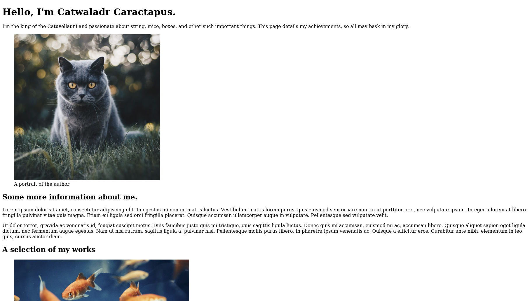
and look something a little like this when viewed in a web browser (though obviously with different content if you are using your own):
In the next chapter we will start work on the main page content.
Footnotes
- In HTML terminology a page is referred to as a document.
- Mine is called website_1_final, but you probably want to name it something a bit more friendly such as 'My Portfolio' for something similar.
- e.g. the homepage of a website called example.com would be a file called index.html in a folder named example.com. The contact page would also be called index.html, but would be located in a sub-folder of example.com named contact.
- I will be using dummy content for this project just to show you how the website would look were you to make a similar site for yourself. Please do replace the text and images here with something appropriate to yourself, that way your first ever website might have some additional utility beyond being merely a learning aid.
- Unix is a family of computer operating systems with their roots dating back to the 1970s. Both MacOS and Linux are Unix-like operating systems, and thus share the same path format. Windows, as usual, does things a little differently and you can read more about why windows uses backslashes on how-to geek if you are interested.
Sections
In this chapter we're going to start building the primary content of the page. If you look at a screenshot of the completed page, you should see it is split into different sections: there are a couple of paragraphs of biography, a gallery, a table describing the details of past employments and a contact form. Each of these sections contains distinct information, and we will separate them out in the document to convey this.
To start with, open up the index.html file you have from the end of the last chapter and add the following lines between the end of the header and start of the footer elements. Here the ellipsis … characters are denoting that you should only copy the content between them. Anything before the first and after the last is simply to show where the new lines should be added into the document.
</header>
…
<main>
    <section>
        <h2>Some more information about me.</h2>
        <p>
            Lorem ipsum dolor sit amet, consectetur adipiscing elit. In egestas mi non mi mattis luctus. Vestibulum
            mattis lorem purus, quis euismod sem ornare non. In ut porttitor orci, nec vulputate ipsum. Integer a
            lorem
            at libero fringilla pulvinar vitae quis magna. Etiam eu ligula sed orci fringilla placerat. Quisque
            accumsan
            ullamcorper augue in vulputate. Pellentesque sed vulputate velit.
        </p>
        <p>
            Ut dolor tortor, gravida ac venenatis id, feugiat suscipit metus. Duis faucibus justo quis mi tristique,
            quis sagittis ligula luctus. Donec quis mi accumsan, euismod mi ac, accumsan libero. Quisque aliquet
            sapien
            eget ligula dictum, nec fermentum augue egestas. Nam ut nisl rutrum, sagittis ligula a, pulvinar nisl.
            Pellentesque mollis purus libero, in pharetra ipsum venenatis ac. Quisque a efficitur eros. Curabitur
            ante
            nibh, elementum in leo quis, cursus auctor diam.
        </p>
    </section>
</main>
…
<footer>
<main> and <section>
The first new element we have added here is a main element as a sibling to the header and footer. Just as the footer and header elements represent the footer and header of a document, so too does the main element serve as a container for the page's primary, or dominant, content. You should only have a single main element per page, and all of the document's primary content should be a descendant of it.
The child of our new main element is a section element. The section element is used to group related content that does not necessarily have a more specific element available, such as the headers and footers we have already seen, and it should have a heading element as a child to describe what the content of the section is.
The Mozilla Developer Network suggests that you should use a section where "a section should logically appear in the outline of a document"; for example, if we were creating a page detailing the recipe for a particular meal, we might choose to contain all of the ingredients in one section, and the steps to cook the meal in another. Here, of course, we have used it as a container for the biographical paragraphs.
As the word suggests in the proceeding paragraph implies, there are very few strict rules for building web pages, and it often comes down to using whichever element seems most appropriate. The best guide is to be as specific as possible without altering the meaning of your content (e.g. don't wrap content in a heading just because you can, but if it actually is a heading always mark it as such), as this makes it easy for people and machines to understand it. In the case of sections, the suggestion to think of a document outline is a very good one; think about how you would try and find the information you need if you were speed-reading the page. If someone was only interested in getting in touch with us, they might not wish to read through the rest of the page first. Wrapping related elements together in sections like this helps visitors to find the part of the document they are interested in.
A Gallery
The next thing we are going to add to the page is a gallery showcasing some of the author's work, and we will make this another section. Copy and past the following line after the end of the previous section, and before the end of the main:
    </section>
…
    <section>
        <h2>A selection of my works</h2>
        <ul>
            <li>
                <img src="./images/pexels-elle-hughes-3513239.jpg" alt="Shoal of goldfish in dark blue water." />
            </li>
            <li>
                <img src="./images/pexels-ihsan-aditya-1056251.jpg" alt="Tabby kitten asleep." />
            </li>
            <li>
                <img src="./images/pexels-karolina-grabowska-4498152.jpg" alt="Open wooden box with tape and scissors." />
            </li>
            <li>
                <img src="./images/pexels-monique-laats-736524.jpg" alt="Mouse on branch with nut in its mouth." />
            </li>
            <li>
                <img src="./images/pexels-steve-johnson-845263.jpg" alt="Partially unravelled ball of string against white backdrop." />
            </li>
            <li>
                <img src="./images/maria-teneva-O6BUc58Eb-I-unsplash.jpg" alt="Two purple fish skeletons on glass." />
            </li>
        </ul>
    </section>
…
</main>
The first child of the new section is a h2 describing what the section contains. The img, ul and li elements we have already seen before, they are just being combined here in a new way. There are several ways you could represent an image gallery in HTML, but I like to use a list as I feel that makes the most sense semantically; we are listing out some of the author's work, and those pieces happen to be represented as images.
Wrapping up
After adding the image gallery, your page code should resemble this:
<!doctype html>
<html lang="en">
<head>
<meta charset="utf-8">
<title>My website</title>
</head>
<body>
<header>
<h1>Hello, I'm Catwaladr Caractapus.</h1>
<p>
I'm the king of the Catuvellauni and passionate about string, mice, boxes, and other such important
things. This page details my achievements, so all may bask in my glory.
</p>
<img src="../website_1_final/images/pexels-kirsten-bühne-1521304.jpg"
alt="Grey cat with yellow eyes sitting on grass." />
</header>
<main>
<section>
<h2>Some more information about me.</h2>
<p>
Lorem ipsum dolor sit amet, consectetur adipiscing elit. In egestas mi non mi mattis luctus. Vestibulum
mattis lorem purus, quis euismod sem ornare non. In ut porttitor orci, nec vulputate ipsum. Integer a
lorem
at libero fringilla pulvinar vitae quis magna. Etiam eu ligula sed orci fringilla placerat. Quisque
accumsan
ullamcorper augue in vulputate. Pellentesque sed vulputate velit.
</p>
<p>
Ut dolor tortor, gravida ac venenatis id, feugiat suscipit metus. Duis faucibus justo quis mi tristique,
quis sagittis ligula luctus. Donec quis mi accumsan, euismod mi ac, accumsan libero. Quisque aliquet
sapien
eget ligula dictum, nec fermentum augue egestas. Nam ut nisl rutrum, sagittis ligula a, pulvinar nisl.
Pellentesque mollis purus libero, in pharetra ipsum venenatis ac. Quisque a efficitur eros. Curabitur
ante
nibh, elementum in leo quis, cursus auctor diam.
</p>
</section>
<section>
<h2>A selection of my works</h2>
<ul>
<li>
<img src="./images/pexels-elle-hughes-3513239.jpg" https://github.com/BezPowell/building_websites_for_beginners/blob/master/code/s1c5/index.htmlalt="Shoal of goldfish in dark blue water." />
</li>
<li>
<img src="./images/pexels-ihsan-aditya-1056251.jpg" alt="Tabby kitten asleep." />
</li>
<li>
<img src="./images/pexels-karolina-grabowska-4498152.jpg"
alt="Open wooden box with tape and scissors." />
</li>
<li>
<img src="./images/pexels-monique-laats-736524.jpg" alt="Mouse on branch with nut in its mouth." />
</li>
<li>
<img src="./images/pexels-steve-johnson-845263.jpg"
alt="Partially unravelled ball of string against white backdrop." />
</li>
<li>
<img src="./images/maria-teneva-O6BUc58Eb-I-unsplash.jpg"
alt="Two purple fish skeletons on glass." />
</li>
</ul>
</section>
</main>
<footer>
<p>Copyright © Catwaladr Caractapus</p>
</footer>
</body>
</html>
and look something a little like this when viewed in a web browser (though obviously with different content if you are using your own):
If your page doesn't look right, or you think you've made a mistake somewhere, don't worry! As the examples get more complex, it will get increasingly easy to miss out a line when copying, or to accidentally paste it into the wrong place. Take a few minutes and see whether you can figure out what's gone wrong yourself and fix it. If you can't, or would just like to check against my own version you can find the original files I worked from in the book's source code. There are also files for all the other chapters there as well if you would like to study them. It's also possible I have made a mistake with one of the examples; if you do spot this please let me know at [email protected] so I can fix it.
In the next chapter we will add the cv table which will introduce us to a few more html elements.
Tables
The next thing we are going to work on for our page is the details of our author's past employments. Before we start writing any HTML, however, we should take a brief moment to think about how it would be best to represent it. If you look at a typical CV, as well as the employer, they generally contain information about the job title, dates of employment, and a paragraph or two detailing what the job actually entailed. We could convey this by having the job titles or employers as some form of heading element, and any other information as paragraphs; but this would not properly express the fact that each of these fields are related to one another.
The perfect element to represent such 2-dimensional data is a table and, is often what is used on paper CVs as well. Tables in HTML, unfortunately, do how a small number of minor drawbacks, the main one being the difficulty of representing a two dimensional grid in a markup language. As a result of this, the markup for tables is probably the most complex of any element you will encounter when building websites. So instead of overwhelming you with the final code for the section as I have done previously, we will first learn about how to create tables in a series of smaller stages. This won't take long, I promise.
Table rows and data
The first element we need to create a table is aptly named the table. This serves as the container for all of the data and indicates that anything inside of it is part of the table. The table contents are then split up into rows, represented by tr elements (which stand for table row). Each row then has it's cell data populated using td elements (which stand for table data). Confused? Let's look at an example:
<table>
    <tr>
        <td>Country</td>
        <td>Population</td>
        <td>Language</td>
    </tr>
    <tr>
        <td>UK</td>
        <td>63,182,000</td>
        <td>English</td>
    </tr>
    <tr>
        <td>France</td>
        <td>64,898,000</td>
        <td>Français</td>
    </tr>
    <tr>
        <td>Germany</td>
        <td>80,219,695</td>
        <td>Deutsch</td>
    </tr>
</table>
This represents a table with 4 rows and 3 columns. As you can see, each tr is a child of the table, and the td elements are children of the tr rows. When displayed on a page it will look like this:
| Country | Population | Language |
| UK | 63,182,000 | English |
| France | 64,898,000 | Français |
| Germany | 80,219,695 | Deutsch |
We do not explicitly declare columns in HTML, instead they are inferred from the number of cells in each row. This format can feel extremely unwieldy when you first encounter it but, as mentioned earlier, stems from the difficulty of trying to lay out a grid using markup. If we actually tried to lay out cells in the same way they appear, the browser would have to infer where columns started and ended, which might result in a different layout from what you intended. After you have worked on a few pages with tables you should get the hang of it and it will become second nature.
Table Headings
We now have a basic table, but there is still some critical information missing. Someone looking at the table as rendered by the browser may well be able to guess that the top row represents the column headings, but the markup does not convey this; each row, has an identical structure. To remove this ambiguity we can use a th element with a scope attribute, instead of a td, for any headings. Which will make life easier for any machines or screen reader users reading our page. Have a look at the example below:
<table>
    <tr>
        <th scope="col">Country</th>
        <th scope="col">Population</th>
        <th scope="col">Language</th>
    </tr>
    <tr>
        <th scope="row">UK</th>
        <td>63,182,000</td>
        <td>English</td>
    </tr>
    <tr>
        <th scope="row">France</th>
        <td>64,898,000</td>
        <td>Français</td>
    </tr>
    <tr>
        <th scope="row">Germany</th>
        <td>80,219,695</td>
        <td>Deutsch</td>
    </tr>
</table>
What we have done here is to replace all of the td elements in the first row with th elements to define them as the headings for the table columns. The scope attribute must have a value of either col or row to define whether it is acting as a heading for a column or row.
We have also made the first cell in each of the other rows a heading; this shows that the population and language columns apply to the country, rather than, for example, the UK being the official country of the English language or Deutsch the official language of the number 80,219,695. This might seem unnecessary for people used to languages that read from left to right, as we assume that the first element we see is the most important, but again, this is just about being explicit. When rendered by a browser our updated table will look like this:
| Country | Population | Language |
|---|---|---|
| UK | 63,182,000 | English |
| France | 64,898,000 | Français |
| Germany | 80,219,695 | Deutsch |
By default, browsers also render the text contained in any th elements in bold, which makes things more obvious for sighted users as well. A win-win situation.
Table headers and bodies
There is one final change we are going to make to our example table before we get back to work on our CV page, which again will add a little clarity for anything reading the code. The first row of our table is now composed entirely of th elements, but otherwise looks structurally similar to the other rows. To further differentiate it's component parts, we can split the table into a header and body.
To do this we wrap the first row with the column headings into a thead element and the rest of the rows into a tbody as below:
<table>
    <thead>
        <tr>
            <th scope="col">Country</th>
            <th scope="col">Population</th>
            <th scope="col">Language</th>
        </tr>
    </thead>
    <tbody>
        <tr>
            <th scope="row">UK</th>
            <td>63,182,000</td>
            <td>English</td>
        </tr>
        <tr>
            <th scope="row">France</th>
            <td>64,898,000</td>
            <td>Français</td>
        </tr>
        <tr>
            <th scope="row">Germany</th>
            <td>80,219,695</td>
            <td>Deutsch</td>
        </tr>
    </tbody>
</table>
This won't change how the browser renders the table at all, it just helps us organise the data and provides further clues as to the meaning of the contents. There is also a tfoot to define a footer for a table, but this is less frequently seen. An example of it's use would be the totals row for a financial spreadsheet.
The CV Section
Now we have covered the syntax for building tables in HTML, we can finally add the next section to our page. Copy and paste the following lines between the end of the last section element, and the ending main tag.
    </section>
…
    <section>
        <h2>My greatest achievements</h2>
        <table>
            <thead>
                <tr>
                    <th scope="col">Position</th>
                    <th scope="col">Employer</th>
                    <th scope="col">Description</th>
                    <th scope="col">Date</th>
                </tr>
            </thead>
            <tbody>
                <tr>
                    <th scope="row">Job 1</th>
                    <td>Employer 1</td>
                    <td>Vestibulum vel feugiat nisl, quis consequat odio. Vestibulum tempus venenatis risus a
                        faucibus.
                        Donec a mi finibus, laoreet nisl eget, ultricies tortor.</td>
                    <td>2015 - 2020</td>
                </tr>
                <tr>
                    <th scope="row">Job 2</th>
                    <td>Employer 2</td>
                    <td>Aliquam id sem ante. Morbi eget laoreet est. Donec ut est dapibus, mattis nisl ut,
                        accumsan
                        odio.</td>
                    <td>2014 - 2015</td>
                </tr>
                <tr>
                    <th scope="row">Job 3</th>
                    <td>Employer 3</td>
                    <td>Aenean vitae vestibulum nulla. Quisque purus dui, bibendum nec ex molestie, egestas
                        semper
                        dui.
                        In auctor blandit odio at tincidunt.</td>
                    <td>2012 - 2014</td>
                </tr>
                <tr>
                    <th scope="row">Job 4</th>
                    <td>Employer 4</td>
                    <td>Morbi neque odio, scelerisque in molestie non, vestibulum at ante. Sed sagittis dui at
                        nulla
                        consequat dignissim. Cras convallis aliquam tellus, ac sagittis nisi porttitor ut. Proin
                        lorem
                        augue, feugiat et magna vel, mattis egestas mi.</td>
                    <td>2011</td>
                </tr>
            </tbody>
        </table>
    </section>
…
</main>
All of these elements should now be familiar to you. We have added a new section with a h2 and table as children. The table has a thead and tbody and all of the th elements have the appropriate scope attributes.
Wrapping up
Now that our page is starting to get a little longer, instead of showing the complete code for the page, I will just provide a link to the final index.html for this chapter.
I have talked a lot in this chapter about how we can use specific elements to give added meaning to our content. While many of the changes I made to the table will make no visual difference, and may seem unnecessary at first, you must remember that about 99.9% of the time your HTML files will be read by a computer, rather than a person.
While people are generally flexible and good at inferring meaning from context, machines (unfortunately) are invariably stubbornly inflexible and pendantic; and as our pages must first be processed by machines before anyone can view them, it is in our best interests to be as explicit with our code as we can. Also, if you come back to try and make changes to your pages months or years after initially making them, your future self will thank you if they are as clear and unambiguous as possible.
In the next chapter we will cover how to add links to pages and go over the difference between block and inline elements.
Links
In the previous chapter we added a table of past employments to our portfolio page. This detailed what positions the page's author had previously held, and the companies who employed them. It's likely that anyone reading this would at least be able to guess as to what the job entailed (especially if they are interested in the fields in which the author worked), but the employer may well be totally unfamiliar to them; to save anyone in this situation from having to search on the internet, we will provide a direct link to the various employer websites inside the table.
This also provides me with a vaguely plausible reason for introducing you to hyperlinks in HTML, which (as mentioned in this section's introduction) are probably the single most important building block of the web, so should not be left out.
Anchors
In HTML, hyperlinks are defined using the a tag, which stands for anchor. Think of it a bit like anchoring a line which can then be traced back to something. Anchors support a href attribute, which specifies the link's destination; and the content of the element will form the text of the link. An example is below:
<a href="https://developer.mozilla.org/">MDN web docs</a>
which when rendered by the browser would appear like this: MDN web docs.
URL schemes
The href attribute used above specifies a http-based URL to create a link to another document on the web. Aside from this, href also supports a few other types of value (known as url schemes):
- Fragment URLs
-
Links to another element on the page. Will scroll the page down to bring the element into view. Starts with a hash symbol (#) followed by the
idof the element they link to (e.g.href="#faqs"). - Mailto
-
Links to an email address. Often creates a new email to the address specified using the user's default email programme. These take the form of
mailto:followed by an email address (e.g.href="mailto:[email protected]"). - Tel
-
Links to a telephone number. Will often call the number specified if the user's device supports calling. Takes the form of
tel:followed by a phone number (e.g.href="tel:07457018710".
Opening in a new tab
Hyperlinks can also be made to open in a new tab or window by adding a target="_blank" attribute to the element, but please use this judiciously, as it can be a change to user expected behaviour. The text that you use to illustrate the link should also give some clue as to where the link leads, please avoid links that only say click me or, even worse, just here.
Block and Inline elements
You may have noticed that the a elements in the previous paragraph have behaved a little differently from most of the other elements we've seen so far: they sit within the surrounding content, rather than starting a new line. This is because a is an inline, rather than a block-level, element.
By default, HTML documents are laid out according to Normal Flow, which closely matches a book or manuscript. Elements are divided into two categories, block and inline, with inline elements being laid out next to one another in the writing direction, like sentences of text; and block elements proceeding one after another perpendicular to the inline direction with line-breaks in-between, just like paragraphs.
To appreciate the difference between them, consider the following example:
<p>
    Some paragraph text. This bit is <strong>more important</strong> than the rest.
    It also contains a link to <a href="https://bezpowell.github.io/building_websites_for_beginners/">the introduction</a>
</p>
<ul>
    <li>A list of items</li>
    <li>Contained within a ul</li>
    <li>So order doesn't matter</li>
</ul>
<p>
    Another paragraph for demonstration purposes.
</p>
Here we have defined three ancestor elements (two ps and an ul), which are all block-level. The ul has three li elements as children, which are also block level; and the first p has a strong1 and a as children, which are both inline. When rendered by the browser, the example will be laid out like so:
Some paragraph text. This bit is more important than the rest. It also contains a link to the introduction
- A list of items
- Contained within a ul
- So order doesn't matter
Another paragraph for demonstration purposes.
All of the block level elements are laid out one after another perpendicular to the reading direction, with line breaks in-between. In most western languages this means that block level elements will be laid out starting at the top and working downwards, but depending on the language's reading direction they could go from top to bottom, left to right, or right to left.
In contrast to this, the inline elements are displayed next to one another as a continuos line in the writing direction. Again, here this is left to right, but will vary depending on the writing mode2 of the document.
With the advent of HTML5 block and inline are not quite as strongly defined as they once were, and we will take a more in-depth look at the various ways we can alter Normal Flow in the next section on CSS.
For now, the main thing that we must be aware of is that HTML restricts what elements can be used as the descendants of other elements3. This varies from element to element, but the general rule is that while we can have inline elements as descendants of block level elements, it is invalid HTML to do the opposite. You may have as many strong elements inside a p as you wanted, but you can not include a h2 inside a strong. The main exception to this rule is the a element, which can accept block-level elements as descendants.
Adding the employer hyperlinks
Now that we know how to add hyperlinks to documents, and understand that that can only be the parents of certain elements, we can add the employer website hyperlinks to our table. As this is such a minor change, I will not show you what to do and will ask you to have a go at doing it yourselves. Remember that you can look at this chapter's source code if you get stuck.
In the next chapter we will look at forms, which allow visitors to interact with your website.
Footnotes
- The strong element stands for Strong Importance, and is used to mark content out as having particular importance or urgency.
- The document's writing mode is generally determined by the language set in the html lang attribute, but can be overridden on an element by element basis.
- ol and ul elements may only have li as children, for example.
Forms
Now that our simple portfolio page contains a table of our previous employments, the only thing left to do is add a way for people to contact us; after all, there is no point wowing prospective employers with our skills and experience if they can not get in touch with us.
So far, everything that we have added to our page has been to provide the visitor with information, as doing so is often the primary purpose of a HTML document1. Sometimes, however, you need the information to flow in the other direction, to collect information from the user; and forms in HTML are how you do that. Just like their paper equivalents, they consist of a series of fields that visitors fill in, which when submitted can be read and processed.
Here, we're using a form to allow visitors to send us a message, but they can be used for almost anything where you need to collect data from the visitor; think website logins, getting driving directions, online checkouts, web search engines etc.
Collecting data
To create a form in HTML we use the form element, which then accepts a number of different types of elements as children which act as the fields of the form. When a visitor fills in these fields and submits the form, any data they have entered will be sent to whatever url is specified in the form's action attribute. HTML itself can not do anything with the information that users submit, it can only send it to somewhere else for processing.
This can be very confusing for beginners, as doing anything with the data that users have submitted using your forms requires learning a whole new programming language. However, by decoupling the collection of data from the processing of it, it grants us tremendous flexibility; we can decide whether we want to use that data to log a user in to our website, send them a set of tickets for a particular concert, add their observations to an amateur scientific project, or simple email us a copy of what they entered.
Learning one of these so called 'backend' languages is out of the scope of this book, but fortunately there are services that can handle ths for us, and we will be using one of these for our simple contact form. Before we start looking at processing the data from a form, however, we first need to look at collecting it.
Inputs
As alluded to earlier, a form element can accept several types of elements as children to act as its fields. The most common of these is the input element, which has a type attribute to define what type of data we are expecting, and a name attribute to identify the field when we come to process the data.
Users fill out the form by focusing each input in turn to fill them out, and then submitting the form when they have completed it. Focusing an element is often performed by clicking or touching into it with a mouse our touchscreen, but can also be achieved using the tab key on a keyboard to move between them.
An extremely simple form could be created like so:
<form action="https://example.com">
    <input type="text" name="name" />
    <input type="submit" value="Submit Form" />
</form>
Here we have defined a simple form with two inputs. The first is a text field called name, and the second acts as a button to allow submitting the form. When rendered in a browser it will look something like this:
When a user clicks (or touches, or presses enter on their keyboard, or any other way of interacting with it) on the button any data they have entered into the name input will be sent to https://example.com. What is done with the data when it gets there will be entirely dependant on what use the form is trying to serve.
Labels
Our single field form is already completely functional, but it does not convey to the user what information we are expecting them to give us. For that purpose, HTML has the label element. These accept a for attribute, which contains the id of the element they are associated with, and any content they are given will become the label. In HTML, the id attribute can be applied to any element, and should be a unique identifier for that specific element; normally we don't have a use for these, but in particular circumstances (such as adding a label here) we may need to add one.
We could add a label to our text input like so:
<form action="https://example.com">
    <label for="name">Your name</label>
    <input type="text" name="name" id="name" />
    <input type="submit" value="Submit Form" />
</form>
and when rendered by the browser it would look like this:
Labels are extremely useful, as the text of a label associated with an input is read out to screen-reader users when they focus on the input. Also, if users click or touch the label it will automatically move focus to the input, ready to enter data.
Other field types
So far, we have only seen a plain text field, but HTML supports many other types of inputs. The input element itself supports many different values for its type attribute, including: number, email, password, color, date and file etc. By specifying the correct type of input the browser will change how they are presented to the user (such as a date picker for the date field, or increment and decrement arrows on numbers) and will perform some basic validation on the inputs to ensure the user has entered the right kind of data (checking that a valid email address was entered, or only a number into a number field for example).
Selects
In addition to the input element, there are also a few other types of element that can be used as fields. An example of this is the select element, which has one or more option elements as children; the contents of which provide the items in a drop-down list. We could create a select field for booking tickets to events like this:
<form action="/booking">
    <label for="ticket-type">Type of ticket:</label>
    <select name="ticket-type" id ="ticket-type">
        <option value="standing">Standing</option>
        <option value="box">Box</option>
        <option value="backstage">Backstage Pass</option>
    </select>
</form>
Ordinarily, the value of a field when the form is submitted will be whatever data the user entered, but in the case of a select element it will be the value attribute of the selected option. When rendered by the browser the above form would appear like this:
Textareas
The text input used in our first example form only works for a single line of text, such as a name or message subject. For multi-line fields we instead use a textarea. Just like an input the textarea should have an associated label and can have the number of allowed characters restricted using a minlength and maxlength attribute. Unlike inputs, however, a textarea is not self-closing and must have a closing tag like so:
<textarea>
</textarea>
There are many other possible children allowed for a form element that I have not covered here. A good reference for all of them, and the attributes they can accept, is on MDN.
Building a contact form
Now that we know how to create a form in HTMl, we are ready to add one to our page. For processing any data submitted to the form I used an online service called getform.io2. It is a paid service, but at the time of writing they have a free plan where you can add a single form and accept up to 50 submissions a month.
Generally, any external service must be thoroughly checked for security and how they handle your data, but for the purposes of testing it should be fine. If you happen to be experienced in any of the backend languages that can be used to process form data feel free to write that part yourself.
First of all, let's add the contact form to our portfolio page. Insert the following lines after the last section and before the closing main tag:
<section>
    <h2>Get in touch</h2>
    <form action="https://getform.io/f/921c2467-5918-4ddd-88e5-ee8f7674034d" method="POST">
        <div>
            <label for="name">Your Name:</label>
            <input type="text" name="name" id="name" />
        </div>
        <div>
            <label for="email">Your Email:</label>
            <input type="email" name="email" id="email" required />
        </div>
        <div>
            <label for="subject">Subject:</label>
            <input type="text" name="subject" id="subject" />
        </div>
        <div>
            <label for="message">Message:</label>
            <textarea name="message" id="message" required></textarea>
        </div>
        <div>
            <button type="submit">Send</button>
        </div>
    </form>
</section>
As before we have added a new section element to hold our contact form. The form itself has an action url pointing to whatever page will process our data. In the case of the example this is my test form on getform.io, but you will need to replace it with the url that is unique to your form. The method="POST" attribute is indicating that this form's data should be sent with a POST, rather than a GET, request. The differences between the two are a little complex to worry about for now3 but, essentially, a POST request is more secure; what you want when sending any form of personal information.
By default, inputs and labels are both inline elements, and I have wrapped them in simple div tags to separate them out. A div is a semantically meaningless block level element that can be used to group elements when no other specific elements are appropriate.
The only other thing which is new in this example is the addition of the required attribute to the email and message fields. Any fields that are marked as required will prevent the user from submitting the form if they are empty and the browser will display a message indicating that they should be filled in; this is a little unusual as it does not take a value, but is an empty attribute. Please use these judiciously as they can be confusing to users, but insisting that a contact form must have a message and way of getting back in touch with the user seems reasonable.
The only other thing to do now is to setup the form processing. If you decide to use the same service as myself they have some good documentation on how to do this. Essentially, all you want to do is create a new form, copy the action url into the action attribute of the form on your portfolio page, and setup an email notification. Their documentation covers all of this.
If you decide you would like to process the data in another way feel free to do so.
Footer links
As a final change I have also added mailto: and tel: links to the page's footer in case the form does not work, or users would prefer to contact us directly. Do this at your discretion, as bots can sometimes get hold of an email and send spam emails. It is often a good idea to add additional contact methods to a site, however, as not everyone uses email or finds filling in forms convenient.
The updated footer code is below:
<footer>
<p>Copyright © Catwaladr Caractapus</p>
<h3>Contact</h3>
<ul>
<li>Email: <a href="mailto:[email protected]">[email protected]</a></li>
<li>Telephone: <a href="tel:07000000000">07000 000 000</a></li>
</ul>
</footer>
Wrapping up
Now that the contact form has been added, the HTML for our basic portfolio page is complete. If you run into any issues, or just want to see what my version looks like, you can get the page's source code on github.
We've covered a huge amount over the last nine chapters, and if there is something you are still unsure of please do go back and read it again. The best way to learn is by doing, so do try putting your new skills to the test by making some other webpages. Perhaps you could try making a basic news article, or recipe for cooking your favourite dish?
The main thing to writing good HTML is using appropriate elements for the content. As there are more elements available than can be comfortably remembered a good reference is essential, and perhaps the best is the Mozilla Developer Network; they also have some excellent tutorials that explain many of the concepts we have covered in greater depth.
In the next section we will look at CSS. Another language of the web that allows us to change the visual display of web pages.
Footnotes
- Think about how many pages consist of things to read / watch, versus those asking you to enter information.
- I am in no way affiliated with this company. Their service just seemed like the easiest way of allowing you to see your form was working without teaching you a whole different language.
- If you are interested you can read more about it here.
CSS
Well done, you've made your first webpage. With somewhere to host it (more in this later) you now have a fully-functioning portfolio that proves you know how to make websites. If yo8u haven't alrady, this might be a good point to take a short break and let your brain digest what you've learned so far. We will be cahnging tack a little in this section and starting to learn a new languauge, and some space between might help to stop things getting muddled. Once you feel you're ready to learn some more new things, read on.
Adding style: CSS
At the end of the previous section we made the finishing touches to our first webpage. If you're anyhting like me, however, you might have though that it looks a little, boring. Those of you old enough to remember the world wide web of the 90s and early 2000s may remember the plain-text and blue hyperlinks with some nostalgia, but the fact is that most website don't look like this anymore; pick 5 different sites at random, and it's likely you'll see 5 very different combinations of page layout, fonts, colours, and overall 'feel'. All of these websites' content is still defined using HTML, so how do they look so different? The answer, is CSS.
CSS is another computer language like HTML. The acronym stand for Cascading Style Sheets, and its purpose is to add style to HTML documents, to change the way they display on a screen. Just like HTML, it's also written entirely in text.
Properties and Values
At the core of CSS are what's called properties and values. A property is something that can be styled, such as the colour or typeface of text, or the width of images. A value is whatever you want to set that property to, such as "Times New Roman", red, or 200px (px is an abbreviation of pixels). To add styling to an element using CSS, we use the style attribute, like so: style="property: value;". Eache set of property and value pairs is seperated by a colon (:) and ends with a semi-colon (;).
To return to the previous example, if we wanted ta red paragraph set in Times New Roman, we would write it like so:
<p style="color: red; font-family: Times New Roman;">This is a red paragraph</p>
There are many, many more properties and values that can be used to style elements; far more than would be practical to cover in this book. Once again, MDN is your friend for referencing them. For now, let's just practice what we've learned by making all of the paragraphs in our portfolio page ???. I'll do the first one for you:
Now go and change the rest yourself.
In the next chapoter, we'll introduce some more properties that can be styled, and discuss some potential problems with the style attribute.
External stylesheets and selectors
After finally learning how to change the visual appearance of pages in the last chapter, you're probably raring to go and eager to learn as many properties and values as you can. Before we continue, however, I have a confession to make: the style attribute that I showed you is not considered the best way to add CSS to webpages. The reason I showed you this way first, and not the recommended way, is because it's the easiest way of getting styles onto a page (and, therefore, the quickest) and because its downsides nicely demonstrate a few important points about building websites.
First of all I'll show you the best practice way of adding styles to a page, and then I'll explain why this is recommended over using the style attribute.
External stylesheets: Rules and Selectors
Keeping it DRY
As you may noticed during the exercise at the end of the last chapter, adding the same CSS to every instance of a HTML element is very repetitive, something which external stylesheets overcome. Not only is this repetition fairly tedious, but it's also prone to error. Even assuming that you are copy and pasting the same style attribute from element to element - as opposed to typing in the deceleration by hand - each time you do so increases the likelihood that you might make a mistake; pasting the text in in the wrong place, perhaps, accidentally overwriting par or all of an existing attribute, or even skipping an element altogether.
There's a principal in programming called DRY, which stands for Don't Repeat Yourself. In essence, this is a shorter way of saying what we ave just covered above: each time you have to type the same piece of text it increases the likelihood of error, so it is better to only define something once, and then reuse it.
Writing DRY code is also extremely valuable when we want to change things later. Imagine that in six months time you wanted to change the font on all of your paragraphs. Think how much more difficult that would be if you had to do it on every individual element, rather than changing one property value pair in an external stylesheet. Avoiding repetition reduces the chance of mistakes, and makes it easier to modify your code when you want to change things in future.
Separating our concerns
The other reason why using the style attribute on individual elements is considered bad practice is to do with what is called the separation of concerns. This is another principal that says that the content of a document and its visual presentation should be kept separate, with as little overlap as possible. A page's HTML document should only define what the content is, and any CSS files should only include rules for styling content. In the real world this is never completely possible - combination selectors (which we'll cover in the next chapter) do need to know about the HTML structure to a certain extent, and classes in html (also the next chapter) rely on there being a cosponsoring entry in the stylesheet - but we should aim to follow it as best we can.
Why should we care about separating content and styling? Part of the reason is about re-usability. At the moment, we're only working on a single web page, but most sites have many different pages, all sharing a similar visual presentation. By keeping all of their CSS in one (or sometimes multiple) stylehseet, and referencing that from each document, websites' can avoid having to define the same styles more than once, and make it easier to update them all in future; the DRY principal again.
The other main reason to separate content and styling is to do with how they are consumed. Most of you reading this book probably read the content on a webpage by visiting the site in a browser, using the site's default styling. However, this is far from the only way that content is accessed. Most of the visits to a typical website are not actually made by humans, but by automated scripts called 'bots' or 'spiders'. The most well know of those, called 'crawlers', are operated by search engines (google, yahoo, bing, yandex etc) to discover pages on the web and download their content to a database. When someone makes a search this database is then consulted, so relevant pages can be displayed on the search results page quickly.
Automated scripts like this don't care about what a page looks like, only what the content is, so it would be pointless to also make then download all the instructions for how to style the page.
Aside from bots, there are also lots of ways that human visitors interact with webpages where the style would be irrelevant. The 'reader' view now built into many browsers takes the content of a page and displays it in a way to make reading easier. Likewise, assistive technologies such as the screen readers used by the blind or those with visual impairments that read a page out to the user are mainly interested in the content, not the styling (only a handful of CSS properties are taken into account by screen-readers, we'll cover them later).
By treating content as independent from styling, we can ensure that our decisions on how to define that content - what HTML elements to use etc - are made purely on the basis of what it should mean, not how it should appear. It's very easy to fall into the trap of picking a HTML element by how it makes the content look, not what it makes the content mean, and doing so is a disservice to all the users (human or machine) who don't need to this.
If you're now suddenly getting anxiety about picking the wrong elements, or having a nightmare trying to change your pages in future, please don't worry. All this chapter is hoping to demonstrate is that keeping your content separate from your styling is better for you and your visitors and explaining why that is. From now on we're going to exclusively use external stylesheets and try and reuse things as much as the language allows us. It does mean a few more things to learn initially, but it will make your life easier in the long run; trust me.
Classes and Combinators
Now that we have seen the basics of how CSS files work, we can start applying some styling to our page. To load a stylesheet from a HTML document we use a link element in the document head, which has a href attribute to define the URL of the link destination.
The link element is used to define relationships between the document and other resources, these are usually external stylesheets, but can be other types of file as well. As a result of this, links also require a rel attribute to tell the browser the type of file they are linking to1.
Open the index.html file from the previous section in a text editor, and add the following lines to the head:
<head>
    <meta charset="utf-8">
…
    <meta name="viewport" content="width=device-width, initial-scale=1">

    <link rel="stylesheet" href="./style.css" />

…
    <title>My website</title>
</head>
As you can see we have added a link element with a rel of stylesheet, with a href pointing to ./style.css. If we now create a file called style.css in the same folder as index.html, any CSS rulesets that we add to it will be applied to our page.
Meta viewport
We have also added a new meta tag to our document's head. This has a name of viewport, and quite a complicated content attribute. When mobile devices first began to appear websites were often designed only to be viewed on a desktop, and content that was too wide could be lost off the edges of a user's screen. To counteract this, mobile browsers started zooming a page out so that everything was on screen; users could them zoom in to the piece of the page that they were interested in and pan around to view content.
While useful for viewing websites that cater only for desktop users on a mobile device, this behaviour can hinder us in creating a page to work across all forms of devices. The new meta element added to the page counteracts this behaviour by instructing the browser that the page width should be equal to the device's screen width, and it should initially appear without being zoomed in or out.
Adding some colour
body {
    background-color: #1c0b08;
    color: #00c2ca;
    font-family: "Arial Black", "Arial Bold", Gadget, sans-serif;
}
The background-color property is very similar to the color property, but instead of setting the text colour of an element, it instead sets the colour of the element's background. We have also changed the font-family property to ensure it is a little more consistent across browsers and operating systems.
Black text on a white background, owing to its hight contrast-ratio2, does have the advantage that it is very easy to read, especially when your page is being viewed in sub-optimal conditions, such as bright sunlight. Any colour scheme that we choose for our sites should also take this into account. Fortunately, there is a international standard for web accessibility called WCAG3, which includes a section on colour contrast, you can read more about that on the official website, there are also automated checking tools available to help with this.
Colouring anchors
If you refresh the browser you should see that our page is beginning to look a lot more like the screenshot. If you scroll all the way down to the bottom, however, you may notice a problem: the links are not following the new colour scheme.
In order to differentiate links from ordinary text, browser's set them to have a color of blue, in contrast to black for other text. What this means for our stylesheet is that, because they don't have a value of inherit, links will not use the color set on the page body. We can override this behaviour, of course, by making a unique ruleset for links.
We could set the color property on links to inherit so they behave in the same way as other elements, but that would remove a visual indicator for users and make it harder to tell them apart.
Visitors to websites expect links to be a different colour from the body text (as well as having an underline), and if we change that behaviour it can make using our sites more difficult; especially for those with poorer eyesight or some form of cognitive impairment.
Instead, we are going to replace the colour with something that is easier to read against our dark background, but still different from the main body text.
a {
    color: #43bce9;
}
If you refresh your browser again the links should now appear like this:

Classes
The design for the page shows some sections with the colours swapped, using the background colour for text, and vice versa. However, all of the sections on our page are created using the same section element, so how can write a selector that targets only some of them? One way to do this is through classes.
Classes are additional attributes that can be added to html elements, and then specifically targeted in CSS. To add a class to an element we use the class attribute. This takes one or more class names, separated by spaces, like so:
<p class="class1 class2 class3">Some text</p>
The p element in the example above has a class attribute with the value class1 class2 class3, and thus has three separate classes; class1, class2, and class3.
Class names must be composed of letters, numbers, hyphens (-), or underscores (_); though the first character can not be a number, and if it begins with a hyphen the next character must be a letter or underscore. Generally, I find it easiest to just use letters, with underscores to replace spaces if I want to use more than one word in a single name, but use whatever system works best for you.
Class selector
Up until now, all of our rulesets have used what are known as element selectors; formed by simply typing the name of the element, followed by the rule block. If we are to simply replace that with the name of a class (e.g. class2 {}), the browser would assume that we were trying to select a type of element, even if it is not one that is defined in the HTML specifications.
To indicate that we want to select a class, we must use a class selector by prefixing the class name with a full-stop (.) like so:
.class2 {
    color: red;
}
This ruleset will then target all elements that have a class of class2. The way class selectors work is that any element that has a matching class will have the styles applied, regardless of which order its classes are defined, or how many it has. So, to return to our previous example, the p element would match this selector, despite its class attribute being class="class1 class2 class3", as class2 is one of the names it has specified.
Styling the sections
Using classes we can now style the alternate colour sections. Go through the page html and add a class="contrast-section" attribute to each section that you want to have a different colour scheme. Once the attributes are there, we can add the follwing ruleset to our stylesheet:
.contrast-section {
    background-color: #00c2ca;
    color: #000011;
}
If you refresh the page now you should see that only the sections with a class added have changed their colour scheme. There are, however, two problems: the background colour doesn't go all the way to the edge of the screen as it does in the design, and any links on the coloured sections are almost invisible.
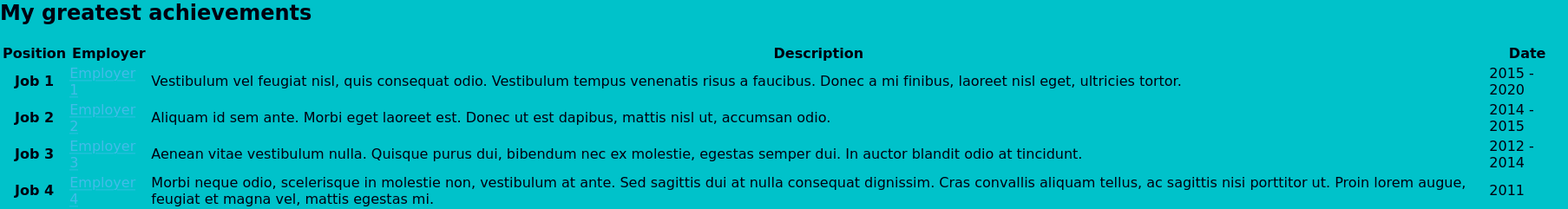
The gap between the edge of the section and the page is due to some of the browser's default styling. We will fix this in a later chapter when we explore sizing elements in CSS.
As we have just used a new class to change the background of certain sections, we might be tempted to correct the link colours by adding a different class to all of the effected a elements; but correcting the colour in this way would require that we remember to add the class to any additional links we add at a later date, or remove the class if we change the colour of the section in the future.
To avoid inflicting this additional maintenance burden on our future selves we can instead utilise another feature of CSS: combinators.
Combinators
Combinators, as the name suggests, allow us to combine different selectors together. By using combinators, we can write selectors that - instead of selecting all elements of a certain type, or that have a certain class - have a particular structure in the document.
Descendant combinator
This might sound a little confusing, so let's look at an example using one of the most common combinators: the decendant combinator, represented by a space ( ):
ul li {
    color: red;
}
What the above selector does is target any li elements that are descended from an ul element. Selectors in CSS start from the right, and work their way leftwards; at each combinator the browser checks whether the relationship that it describes applies when continuing to the left, and stops if that is not the case.
We can chain up as many combinators as we like in a selector, with the relationship that it describes getting more specific as the selector grows larger.
Let's look at another example:
.special-list ul li {
    color: purple;
}
In this case our selector is still looking for li elements that are descendants of a ul, but now it will only apply if the ul is in turn descended from an element with the class of special-list. As we have seen from styling classes and elements, selectors also apply on a case by case basis; so if we had two special-list elements, both with uls, then the li elements in all of them would become purple.
Child combinator
Similar to the descendant combinator, is the child combinator, represented by an right angle bracket >. The child combinator, however, only applies if the element to the right of it is directly descended from the element to the left. If we were to modify the previous example like so:
.special-list > ul li {
    color: purple;
}
Now the ruleset will only apply if the ul is a child of an element with the special-list class. If the spacing between the two elements is any more than a single generation the ruleset will cease to apply, like with the HTML below:
<div class="special=list">
    <p>This is the first special list</p>
    <div>
        <ul>
            <li>These are the</li>
            <li>First list</li>
            <li>items</li>
        </ul>
    </div>
</div>
<div class="special=list">
    <p>This is the second special list</p>
    <ul>
        <li>These are the</li>
        <li>second list</li>
        <li>items</li>
    </ul>
</div>
With the above HTML our descendant combinator ruleset would apply to all the li elements, but the version using the child combinator would not apply to the lis in the first list, as their parent ul is not a child of the special-list, only a descendant.
The child and descendant combinators are the most frequently used, but there are a few others available as well, including two for selecting sibling elements. MDN has a good list of combinators, as well as details on how they work.
Correcting the link colour
Using the descendant combinator we can ensure that all a elements that are descendants of a contrast-section have a color which is readable against the background:
.contrast-section a {
    color: #242424;
}
By using a combinator here we have ensured that any links will have a legible colour, without us having to assign them all classes. Additionally, if we decide to remove the class from the section for any reason, the links will remain legible against the body without us having to make any further changes.
As with the standard link colour I have here selected one that is different from the surrounding text, but still legible against the background:
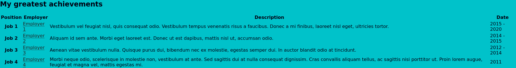
Wrapping up
We have covered a tremendous amount of ground in this chapter, much of it concepts that we have not really encountered previously; so don't be worried if you find yourself struggling to remember everything or having to re-read some parts; this is far more likely due to my failings as a teacher than something on your end.
If you have got this far and are wondering how exactly the browser chooses one color declaration for links above the other, well done! This selection process is handled by the cascade part of Cascading Style Sheets, and we will be examining that in the next chapter.
Footnotes
- When loading a page the browser can only download so many files in parallel, and uses the type of file to assign a loading priority. As CSS files effect how the browser should render the page, they are assigned a higher priority than most other resources to ensure the page is usable as quickly as possible. If we did not define the filetype in the link attribute, the browser would have to first download the file to determine its type, losing this advantage.
-
The contrast-ratio is the difference in luminance (or lightness) between the colour of text and background. As many people are colour-blind or have low-colour vision, this calculation deliberately does not take into account the differences in hue (or colour). As a result, some colour combinations that might look very different, can in fact have quite low contrast-ratios owing to their similar luminance levels.
Generally speaking, the higher the contrast, the easier it is to read; especially for those with poorer eyesight. Unfortunately, this is not always the case, and certain people (such as many with dyslexia) actually find low-contrast easier to read as it creates less visual stress. I generally try and aim for a colour combination that meets the WCAG AAA criteria, but isn't as high contrast as pure black on white.
- WCAG covers far more than just colour-contrast and has guides and standards for pretty much every area of building websites. By following their standards for your own websites you ensure that as many people as possible, regardless of their level of ability, can use what you create. It can sound quite daunting at first, but often just stems down to using the right HTML element for the job, and thinking how you would interact with what you're building if you couldn't use a particular input device, or couldn't perceive things through a particular sense.