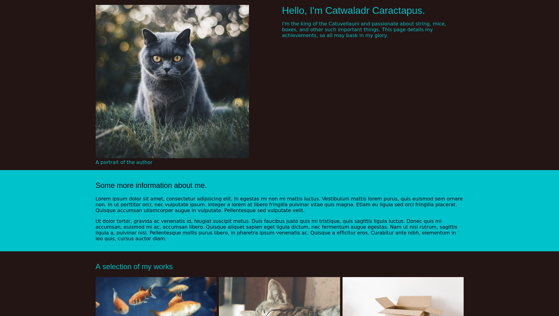
Classes and Combinators
Now that we have seen the basics of how CSS files work, we can start applying some styling to our page. To load a stylesheet from a HTML document we use a link element in the document head, which has a href attribute to define the URL of the link destination.
The link element is used to define relationships between the document and other resources, these are usually external stylesheets, but can be other types of file as well. As a result of this, links also require a rel attribute to tell the browser the type of file they are linking to1.
Open the index.html file from the previous section in a text editor, and add the following lines to the head:
<head>
    <meta charset="utf-8">
…
    <meta name="viewport" content="width=device-width, initial-scale=1">

    <link rel="stylesheet" href="./style.css" />

…
    <title>My website</title>
</head>
As you can see we have added a link element with a rel of stylesheet, with a href pointing to ./style.css. If we now create a file called style.css in the same folder as index.html, any CSS rulesets that we add to it will be applied to our page.
Meta viewport
We have also added a new meta tag to our document's head. This has a name of viewport, and quite a complicated content attribute. When mobile devices first began to appear websites were often designed only to be viewed on a desktop, and content that was too wide could be lost off the edges of a user's screen. To counteract this, mobile browsers started zooming a page out so that everything was on screen; users could them zoom in to the piece of the page that they were interested in and pan around to view content.
While useful for viewing websites that cater only for desktop users on a mobile device, this behaviour can hinder us in creating a page to work across all forms of devices. The new meta element added to the page counteracts this behaviour by instructing the browser that the page width should be equal to the device's screen width, and it should initially appear without being zoomed in or out.
Adding some colour
body {
    background-color: #1c0b08;
    color: #00c2ca;
    font-family: "Arial Black", "Arial Bold", Gadget, sans-serif;
}
The background-color property is very similar to the color property, but instead of setting the text colour of an element, it instead sets the colour of the element's background. We have also changed the font-family property to ensure it is a little more consistent across browsers and operating systems.
Black text on a white background, owing to its hight contrast-ratio2, does have the advantage that it is very easy to read, especially when your page is being viewed in sub-optimal conditions, such as bright sunlight. Any colour scheme that we choose for our sites should also take this into account. Fortunately, there is a international standard for web accessibility called WCAG3, which includes a section on colour contrast, you can read more about that on the official website, there are also automated checking tools available to help with this.
Colouring anchors
If you refresh the browser you should see that our page is beginning to look a lot more like the screenshot. If you scroll all the way down to the bottom, however, you may notice a problem: the links are not following the new colour scheme.

In order to differentiate links from ordinary text, browser's set them to have a color of blue, in contrast to black for other text. What this means for our stylesheet is that, because they don't have a value of inherit, links will not use the color set on the page body. We can override this behaviour, of course, by making a unique ruleset for links.
We could set the color property on links to inherit so they behave in the same way as other elements, but that would remove a visual indicator for users and make it harder to tell them apart.
Visitors to websites expect links to be a different colour from the body text (as well as having an underline), and if we change that behaviour it can make using our sites more difficult; especially for those with poorer eyesight or some form of cognitive impairment.
Instead, we are going to replace the colour with something that is easier to read against our dark background, but still different from the main body text.
a {
    color: #43bce9;
}
If you refresh your browser again the links should now appear like this:

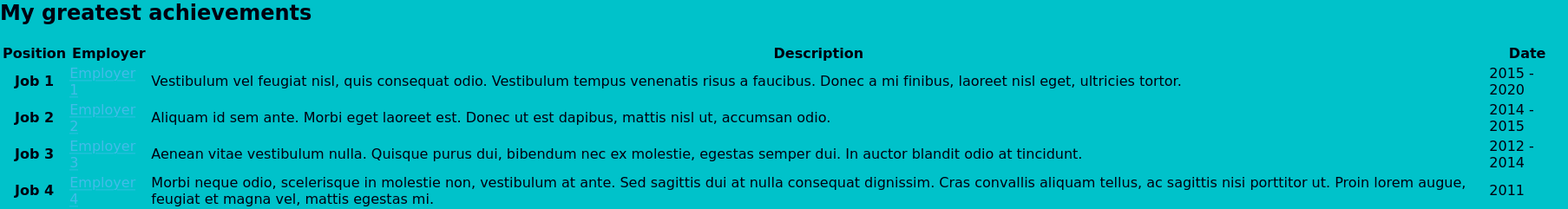
Classes
The design for the page shows some sections with the colours swapped, using the background colour for text, and vice versa. However, all of the sections on our page are created using the same section element, so how can write a selector that targets only some of them? One way to do this is through classes.
Classes are additional attributes that can be added to html elements, and then specifically targeted in CSS. To add a class to an element we use the class attribute. This takes one or more class names, separated by spaces, like so:
<p class="class1 class2 class3">Some text</p>
The p element in the example above has a class attribute with the value class1 class2 class3, and thus has three separate classes; class1, class2, and class3.
Class names must be composed of letters, numbers, hyphens (-), or underscores (_); though the first character can not be a number, and if it begins with a hyphen the next character must be a letter or underscore. Generally, I find it easiest to just use letters, with underscores to replace spaces if I want to use more than one word in a single name, but use whatever system works best for you.
Class selector
Up until now, all of our rulesets have used what are known as element selectors; formed by simply typing the name of the element, followed by the rule block. If we are to simply replace that with the name of a class (e.g. class2 {}), the browser would assume that we were trying to select a type of element, even if it is not one that is defined in the HTML specifications.
To indicate that we want to select a class, we must use a class selector by prefixing the class name with a full-stop (.) like so:
.class2 {
    color: red;
}
This ruleset will then target all elements that have a class of class2. The way class selectors work is that any element that has a matching class will have the styles applied, regardless of which order its classes are defined, or how many it has. So, to return to our previous example, the p element would match this selector, despite its class attribute being class="class1 class2 class3", as class2 is one of the names it has specified.
Styling the sections
Using classes we can now style the alternate colour sections. Go through the page html and add a class="contrast-section" attribute to each section that you want to have a different colour scheme. Once the attributes are there, we can add the follwing ruleset to our stylesheet:
.contrast-section {
    background-color: #00c2ca;
    color: #000011;
}
If you refresh the page now you should see that only the sections with a class added have changed their colour scheme. There are, however, two problems: the background colour doesn't go all the way to the edge of the screen as it does in the design, and any links on the coloured sections are almost invisible.
The gap between the edge of the section and the page is due to some of the browser's default styling. We will fix this in a later chapter when we explore sizing elements in CSS.
As we have just used a new class to change the background of certain sections, we might be tempted to correct the link colours by adding a different class to all of the effected a elements; but correcting the colour in this way would require that we remember to add the class to any additional links we add at a later date, or remove the class if we change the colour of the section in the future.
To avoid inflicting this additional maintenance burden on our future selves we can instead utilise another feature of CSS: combinators.
Combinators
Combinators, as the name suggests, allow us to combine different selectors together. By using combinators, we can write selectors that - instead of selecting all elements of a certain type, or that have a certain class - have a particular structure in the document.
Descendant combinator
This might sound a little confusing, so let's look at an example using one of the most common combinators: the decendant combinator, represented by a space ( ):
ul li {
    color: red;
}
What the above selector does is target any li elements that are descended from an ul element. Selectors in CSS start from the right, and work their way leftwards; at each combinator the browser checks whether the relationship that it describes applies when continuing to the left, and stops if that is not the case.
We can chain up as many combinators as we like in a selector, with the relationship that it describes getting more specific as the selector grows larger.
Let's look at another example:
.special-list ul li {
    color: purple;
}
In this case our selector is still looking for li elements that are descendants of a ul, but now it will only apply if the ul is in turn descended from an element with the class of special-list. As we have seen from styling classes and elements, selectors also apply on a case by case basis; so if we had two special-list elements, both with uls, then the li elements in all of them would become purple.
Child combinator
Similar to the descendant combinator, is the child combinator, represented by an right angle bracket >. The child combinator, however, only applies if the element to the right of it is directly descended from the element to the left. If we were to modify the previous example like so:
.special-list > ul li {
    color: purple;
}
Now the ruleset will only apply if the ul is a child of an element with the special-list class. If the spacing between the two elements is any more than a single generation the ruleset will cease to apply, like with the HTML below:
<div class="special=list">
    <p>This is the first special list</p>
    <div>
        <ul>
            <li>These are the</li>
            <li>First list</li>
            <li>items</li>
        </ul>
    </div>
</div>
<div class="special=list">
    <p>This is the second special list</p>
    <ul>
        <li>These are the</li>
        <li>second list</li>
        <li>items</li>
    </ul>
</div>
With the above HTML our descendant combinator ruleset would apply to all the li elements, but the version using the child combinator would not apply to the lis in the first list, as their parent ul is not a child of the special-list, only a descendant.
The child and descendant combinators are the most frequently used, but there are a few others available as well, including two for selecting sibling elements. MDN has a good list of combinators, as well as details on how they work.
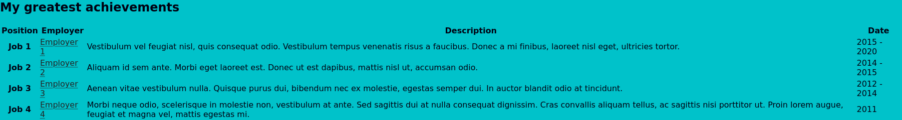
Correcting the link colour
Using the descendant combinator we can ensure that all a elements that are descendants of a contrast-section have a color which is readable against the background:
.contrast-section a {
    color: #242424;
}
By using a combinator here we have ensured that any links will have a legible colour, without us having to assign them all classes. Additionally, if we decide to remove the class from the section for any reason, the links will remain legible against the body without us having to make any further changes.
As with the standard link colour I have here selected one that is different from the surrounding text, but still legible against the background:
Wrapping up
We have covered a tremendous amount of ground in this chapter, much of it concepts that we have not really encountered previously; so don't be worried if you find yourself struggling to remember everything or having to re-read some parts; this is far more likely due to my failings as a teacher than something on your end.
If you have got this far and are wondering how exactly the browser chooses one color declaration for links above the other, well done! This selection process is handled by the cascade part of Cascading Style Sheets, and we will be examining that in the next chapter.
Footnotes
- When loading a page the browser can only download so many files in parallel, and uses the type of file to assign a loading priority. As CSS files effect how the browser should render the page, they are assigned a higher priority than most other resources to ensure the page is usable as quickly as possible. If we did not define the filetype in the link attribute, the browser would have to first download the file to determine its type, losing this advantage.
-
The contrast-ratio is the difference in luminance (or lightness) between the colour of text and background. As many people are colour-blind or have low-colour vision, this calculation deliberately does not take into account the differences in hue (or colour). As a result, some colour combinations that might look very different, can in fact have quite low contrast-ratios owing to their similar luminance levels.
Generally speaking, the higher the contrast, the easier it is to read; especially for those with poorer eyesight. Unfortunately, this is not always the case, and certain people (such as many with dyslexia) actually find low-contrast easier to read as it creates less visual stress. I generally try and aim for a colour combination that meets the WCAG AAA criteria, but isn't as high contrast as pure black on white.
- WCAG covers far more than just colour-contrast and has guides and standards for pretty much every area of building websites. By following their standards for your own websites you ensure that as many people as possible, regardless of their level of ability, can use what you create. It can sound quite daunting at first, but often just stems down to using the right HTML element for the job, and thinking how you would interact with what you're building if you couldn't use a particular input device, or couldn't perceive things through a particular sense.